
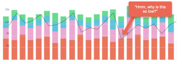
Big Numbers Get Big Focus
Benchmarks & Cluster Comparisons
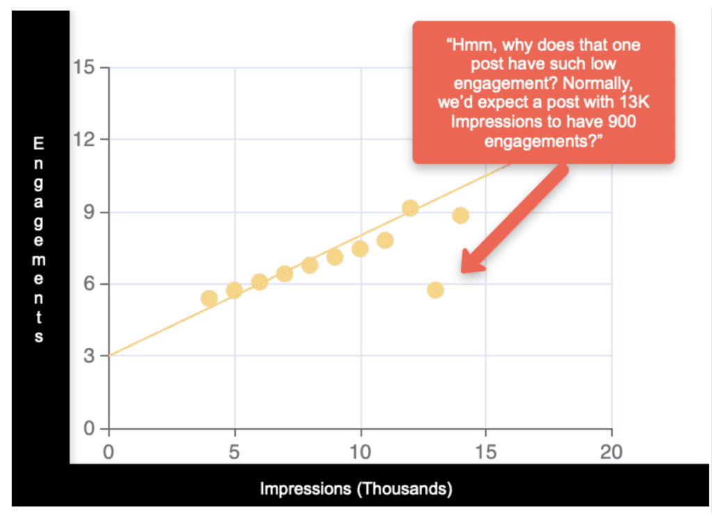
Illustration Note: In this graph, we’re looking at a group of social media posts, and seeing their impressions and engagements. The outlier example shows a post that isn’t the lowest or highest in either Impressions or Engagements. In fact, it might not show up in a report, but its engagement is proportionally low considering how many impressions it has.
You can do this for standard metrics (Sales, Impressions, Awareness, Engagements) or computed metrics like CPA, CPC, or Conversion Rate. But they could also be anything quantifiable!
Coupon codes used, product units purchased, penalties per game, concert tickets sold, energy use per day – part of the fun of this is the broad applicability to a wide range of business types. You could also go multi-dimensional and find outliers using multiple metrics at once, in order to break out larger fluctuations.
Just for fun, here are some examples we’ve seen used with data:
- Ad Targeting Performance: within a global campaign, one company evaluated all of their audience targets across countries to find the audiences that had unusually low/high video completion rates correlated to the spend on that audience.
- Basketball Player Evaluation: you can look deeper than broadly circulated performance stats (like points scored per game), and see if any potential players have a uniquely high (or low) rate of Turnovers Forced vs Possessions Played.
- News Article Category Performance: one publisher compared the number of Visits from Email/Text compared to Article Views to find which content categories were most widely shared compared as a proportion of their viewers (Sports, Obituaries)
What about Anomaly Detection?
It’s worth mentioning – there’s also anomaly detection, and analysis techniques to single out and flag outliers that are wild enough that they need to be investigated (and maybe quarantined). Right now, we’re just focusing on those shiny little nuggets that might otherwise go unnoticed – performers that may hold exactly the information you need to grow.